
Ecommerce Checkout Optimization: 7 Fixes for Estonian Online Stores
Ecommerce checkout optimization is where a store earns back the money it already spent on ads, SEO and product photography. According to Baymard Institute, the average documented cart abandonment rate is 70.22%. Some of that is people who were only browsing, but a large share leaves because of problems the store can fix: surprise costs, forced accounts, long forms and missing payment options.
Online shoppers in Estonia (and in Finland) have clear habits of their own: parcel lockers, bank links, prices with VAT and several languages. A checkout copied from a US template ignores them. This guide covers seven fixes we check first when auditing a store for a Baltic or Nordic business. For the design of the storefront itself (product discovery, product pages and trust), see our separate article on ecommerce website design ideas that convert.
Quick answer: what to fix first
| Fix | Why it matters | Effort |
|---|---|---|
| 1. Show the full price early | 40% of abandoning shoppers leave because of extra costs | Low |
| 2. Make parcel lockers the default | About 80% of Estonian online orders go to parcel lockers | Low |
| 3. Offer local payment methods | Bank links and cards are what local shoppers expect | Medium |
| 4. Allow guest checkout | 18% leave when an account is required | Low |
| 5. Cut form fields to 7–8 | The average checkout asks for almost twice as many | Medium |
| 6. Be clear about delivery and returns | Slow delivery and weak returns policies cause 20% and 13% of abandonments | Low |
| 7. Measure every checkout step | Without a funnel you are guessing which fix works | Medium |
1. Show the full price before the checkout
The most common reason for leaving a checkout is not the product. In Baymard's 2025 survey, 40% of shoppers who abandoned an order said extra costs such as shipping, taxes and fees were too high, and 12% could not calculate the total order cost upfront. The price the customer sees on the product page should be close to the price they pay.
- Show prices including VAT for consumers. Estonia's standard VAT rate has been 24% since July 2025, and Finland's 25.5% since September 2024, so a net price looks cheaper than the final bill and the difference feels like a trick.
- Show the parcel locker price, or "free delivery from €X", on the product page and in the mini cart, not only on the last step.
- If there is a free delivery threshold, show how much is missing in the cart: "Add €8 for free delivery".
- Avoid payment surcharges. If a method costs extra, say so next to the method, not after the click.
2. Make parcel lockers the default delivery option
Estonia is one of the most parcel-locker-heavy markets in Europe. The US International Trade Administration's country guide notes that 80% of purchases are ordered to automated pick-up lockers. A checkout that opens with a long home address form feels foreign to these shoppers.
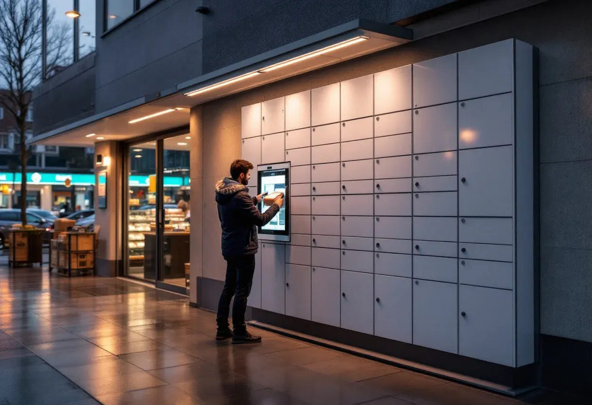
- Offer at least two locker networks. In Estonia that usually means Omniva plus DPD or Smartpost; in Finland, Posti and Matkahuolto are the familiar names.
- Use a searchable locker picker (by city, street or locker name) instead of a dropdown with hundreds of entries. A map is a nice extra, not a replacement for search.
- Remember the last locker for returning customers.
- For locker delivery, ask only what the carrier needs: name, phone number for the pickup code and email. A street address is not needed.
- Show the delivery estimate next to each option ("Omniva locker, 1–2 working days, €2.99").
3. Offer the payment methods local shoppers trust
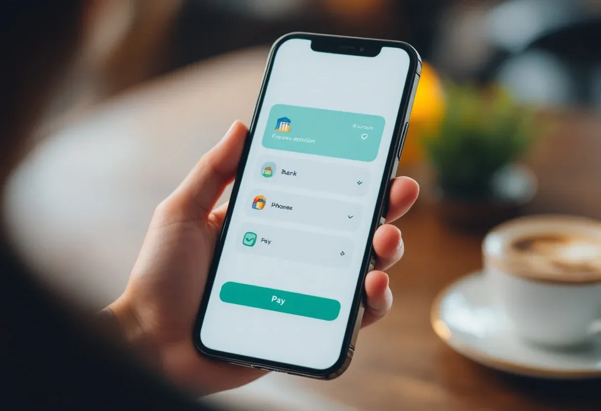
Baymard lists "not enough payment methods" as the reason for 9% of abandonments and distrust in entering card details as the reason for 19%. In Estonia the answer is well known: shoppers expect bank links from Swedbank, SEB, LHV and other local banks alongside Visa and Mastercard. Payment gateways such as Montonio, MakeCommerce (Maksekeskus) or EveryPay bundle these into one integration. Finnish shoppers expect online bank payments, cards, MobilePay and often Klarna, typically through a provider such as Paytrail.
- Show the bank and card logos as selectable buttons, not as a hidden list after a "Pay" click.
- Add Apple Pay and Google Pay for mobile. They skip the card form entirely.
- For higher order values (furniture, electronics), a buy-now-pay-later option can make the decision easier.
- Keep the payment step visually consistent with the store. A sudden jump to an unfamiliar-looking page reduces trust.
4. Let people buy without creating an account
18% of shoppers in Baymard's research abandoned an order because the site required account creation. Accounts are useful for the store, but they should be an offer, not a gate. The best pattern is to put guest checkout first and ask for a password only on the confirmation page ("Save your details for next time?").
Baymard explains the right way to present the guest option on mobile and desktop in this short video:
5. Remove every form field you do not need
A good checkout needs about 12–14 form elements, or 7–8 actual form fields. According to Baymard, the average checkout shows 23.48 form elements, with 14.88 fields. Every extra field is another reason to stop, especially on a phone.
- Use one "Full name" field, or first and last name side by side, never title, middle name and company for consumers.
- Hide "Company name" and "VAT number" behind a "Buying as a company" checkbox. This matters in Estonia, where many small business owners buy through their company.
- Make billing address the same as delivery by default.
- Use the right mobile keyboards: numeric for phone and postal code, email keyboard for email.
- Validate inline as the user types and write error messages that say how to fix the problem.
- Do not ask for a postal code when the customer chose a parcel locker.
Baymard shows how a 16-field checkout was reduced to 8 fields without losing any required data:
6. Be specific about delivery time and returns
Delivery that seems too slow causes 20% of abandonments, and an unsatisfactory returns policy 13%. Vague promises ("fast delivery", "easy returns") do not answer the question. Specific ones do.
- Write a delivery date or range next to each option, and state the cut-off time: "Order by 14:00, shipped today".
- Explain the 14-day right of withdrawal in plain words and link to the full terms from the checkout.
- Say who pays for return shipping and how the return works (for example, via the same parcel locker network).
- Keep contact details visible: a phone number or chat link near the payment button lowers anxiety for first-time buyers.
7. Measure each checkout step, not only sales
If you only track purchases, you know that something is wrong but not where. Set up a funnel in GA4 with the standard ecommerce events view_cart, begin_checkout, add_shipping_info, add_payment_info and purchase. The biggest drop between two steps shows where to work first.
- Compare mobile and desktop separately. Problems are usually worse on mobile.
- Track form validation errors and failed payments as events.
- Check the checkout in every language the store supports (Estonian, Russian, English, Finnish). Untranslated error messages and payment pages are common.
- Change one thing at a time, and give each change two to four weeks of data before judging it.
Checkout checklist for Estonian and Finnish stores
| Area | Check |
|---|---|
| Price | VAT-inclusive prices, delivery cost visible on the product page, no surprise fees |
| Delivery | At least two locker networks, searchable picker, delivery dates shown |
| Payment | Bank links or online banking, cards, Apple Pay / Google Pay, local BNPL where relevant |
| Account | Guest checkout first, account offered after purchase |
| Forms | 7–8 fields, company fields optional, correct mobile keyboards, clear errors |
| Trust | Returns policy, contact details and secure payment explained near the button |
| Language | Checkout, emails and payment pages translated for every store language |
| Analytics | GA4 checkout funnel, error tracking, mobile vs desktop comparison |
When to fix the checkout and when to rebuild the store
Most of the fixes above work on WooCommerce, Shopify and custom stores without a redesign. A rebuild makes sense when the platform cannot support local delivery and payment integrations, when the checkout is slow on mobile, or when every small change needs a workaround. Our team at Major Source audits and builds ecommerce stores and WooCommerce checkouts for businesses in Estonia and the Nordics. You can see a finished example in the Junico ecommerce case, estimate a project in the price calculator or book a call to review your current checkout.

